Roller - Venue managment CRM
Daily capacity
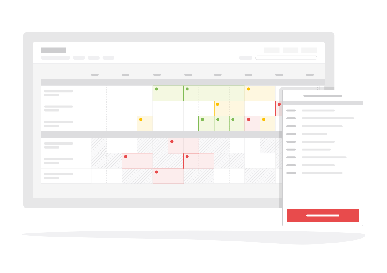
Redesigned the daily capacity management feature improving visual clarity and access to booking information.
Overview
Day-to-day venues manage hundreds of guests against different locations and booking sizes. They range from individuals to families, or to larger parties and groups. ROLLER provides a daily capacity view which helps venues manage their location capacity by indicating the number of guest and availability status for each time slot on a given day.
After the success of the booking calendar we determined that the daily capacity view needed to align more closely with it. We didn't want to redesign the view entirely, but make enough adjustments that daily capacity felt like a natural extension of the calendar. If the booking calendar represents a high level overview, then the daily capacity offers more granular details.
After the success of the booking calendar we determined that the daily capacity view needed to align more closely with it. We didn't want to redesign the view entirely, but make enough adjustments that daily capacity felt like a natural extension of the calendar. If the booking calendar represents a high level overview, then the daily capacity offers more granular details.
Terms
I've provided a short description on terms I use throughout this case study. They are within the context of a Trampoline Park for added clarity.
Locations
The different areas of a venue that guests populate. Each location has a limited number of guests using it at any time. E.g, a trampoline park has a main trampoline location and several party room locations.
Single/multi booking location
Locations fall into two categories; single booking or multi-booking. This indicates whether multiple bookings or a single booking can be made against that location within a time slot. E.g, party rooms are single booking but the general trampoline location will allow multiple bookings.
Time slot
A slot represents a duration of time in the timeline. They indicate when a booking will start and end, with 15 minute intervals being the most common. Products determine the start times intervals and which locations they apply to. A product can span multiple locations which is usually the case for party products.
Concepts
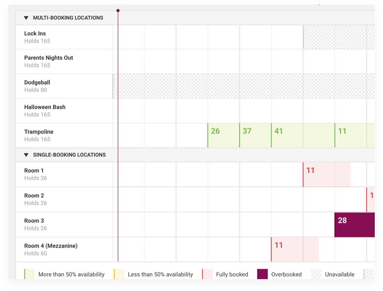
The daily capacity view is represented as a timeline allowing users to view the number of guests across multiple locations at different times of the day.3 items needed to be addressed to improve the daily capacity view.
- Improve visual clarity between capacity statuses
- Permit new bookings to be created through available time slots
- Show existing bookings within the location and/or time slot
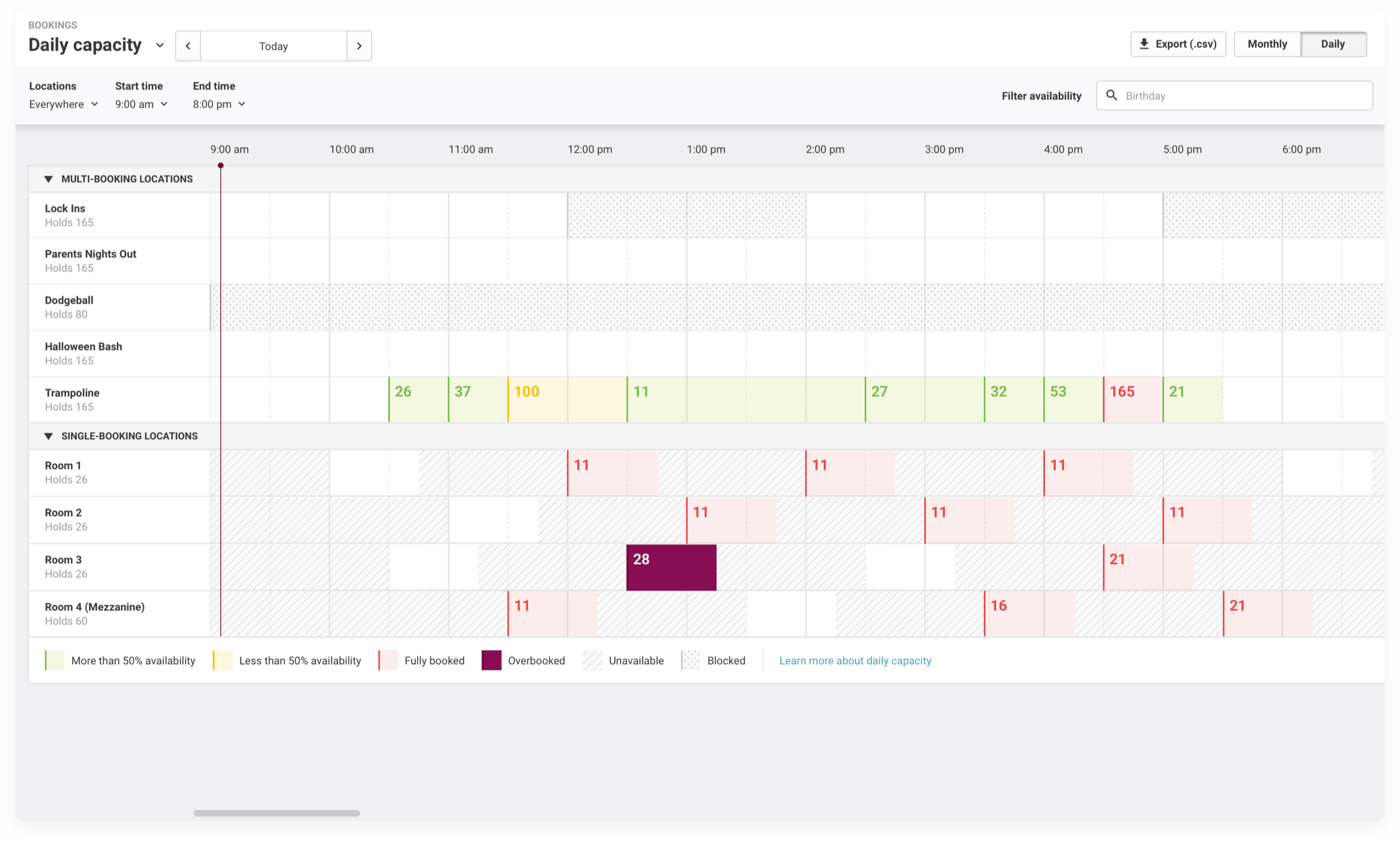
Fig 01. The final result of this redesign
Improving visual clarity
Time slots exist as 1 of 7 different statuses. The previous incarnation of the daily capacity view used only 4 visuals to indicate these statuses. This was insufficient in conveying the necessary information when viewed at a glance.
Using colour and patterns I made each status visually distinct, ensuring neither could be confused for the other and to build a visual hierarchy. This is seen in the use of a solid colour for the overbooked status. It was important that these time slots clearly indicate to venues the number of guests outside their permitted capacity.
Using colour and patterns I made each status visually distinct, ensuring neither could be confused for the other and to build a visual hierarchy. This is seen in the use of a solid colour for the overbooked status. It was important that these time slots clearly indicate to venues the number of guests outside their permitted capacity.
You'll note that I didn't use a strong red colour, which is what most designers would use by default. ROLLER's primary colour is red and using it to indicate a warning or error state could build a negative association with the brand.
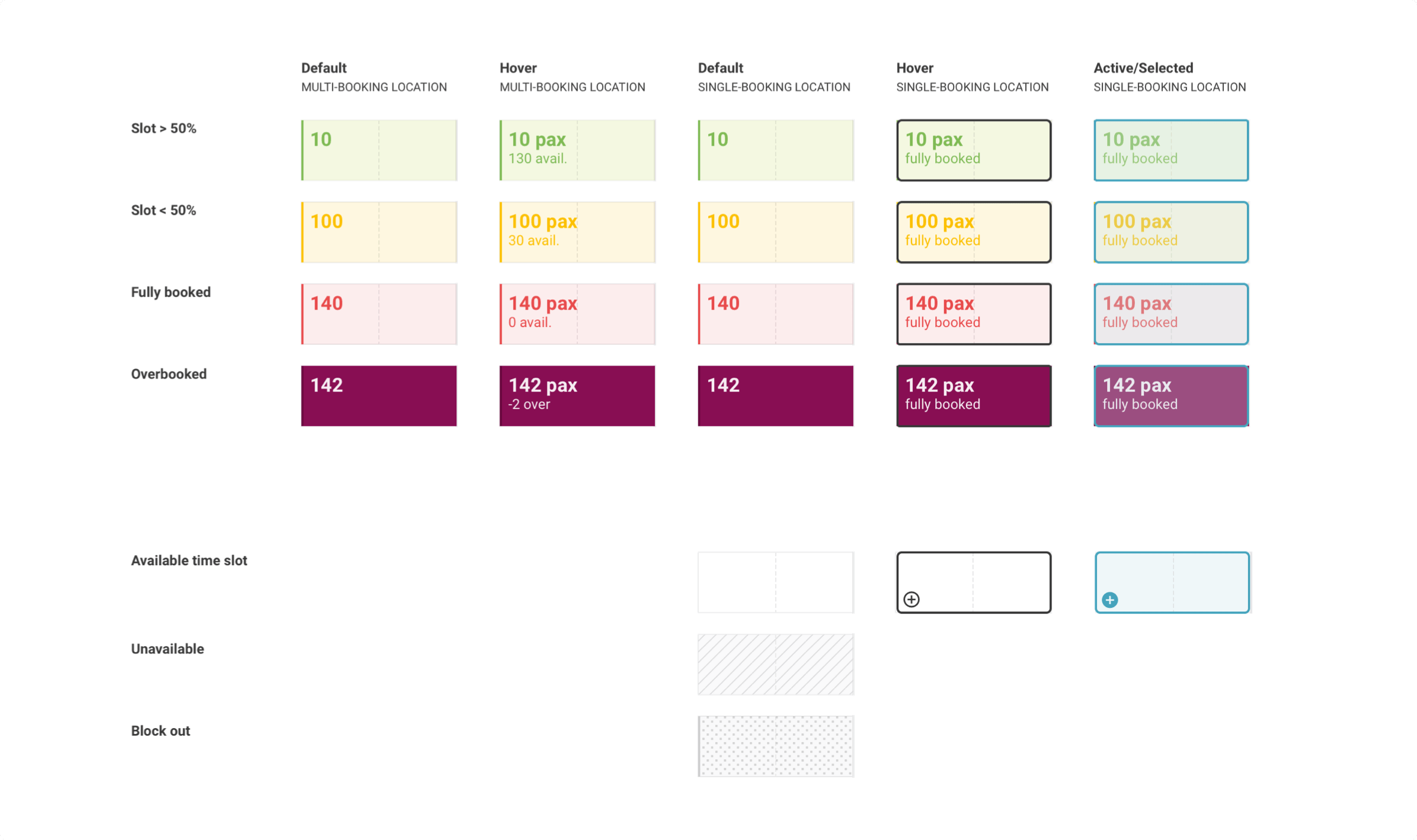
Fig 02. The different components for indicating a time slots' status
Location groups
Next I grouped locations by type; multi-booking or single booking. This was necessary as we only wanted single booking locations to have the ability to start a new booking. Leaving non-interactive time slots with interactive ones would have led to a lot of confusion, but by separating them the distinction is clearer.Grouping the locations also made the others changes I needed to make more viable.
Viewing availability and creating new bookings
Users select products and categories, using the search selector, to highlight available slots on the timeline for single booking locations. Since a single booking location only takes one booking per time slot it was more straight forward for us to implement, easier to highlight and select an available slot since intervals were often 15 minutes or greater apart.
Unavailable slots, being those slots where no start time has been set, are shaded while available slots are kept clear. The available slots are selectable and when clicked display the availability panel. Products able to purchased and their available time slots are listed, starting the process of a new booking.
Unavailable slots, being those slots where no start time has been set, are shaded while available slots are kept clear. The available slots are selectable and when clicked display the availability panel. Products able to purchased and their available time slots are listed, starting the process of a new booking.
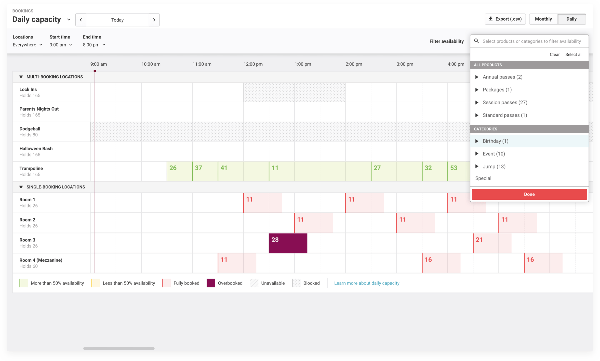
Fig 03. Users start by selecting products and categories
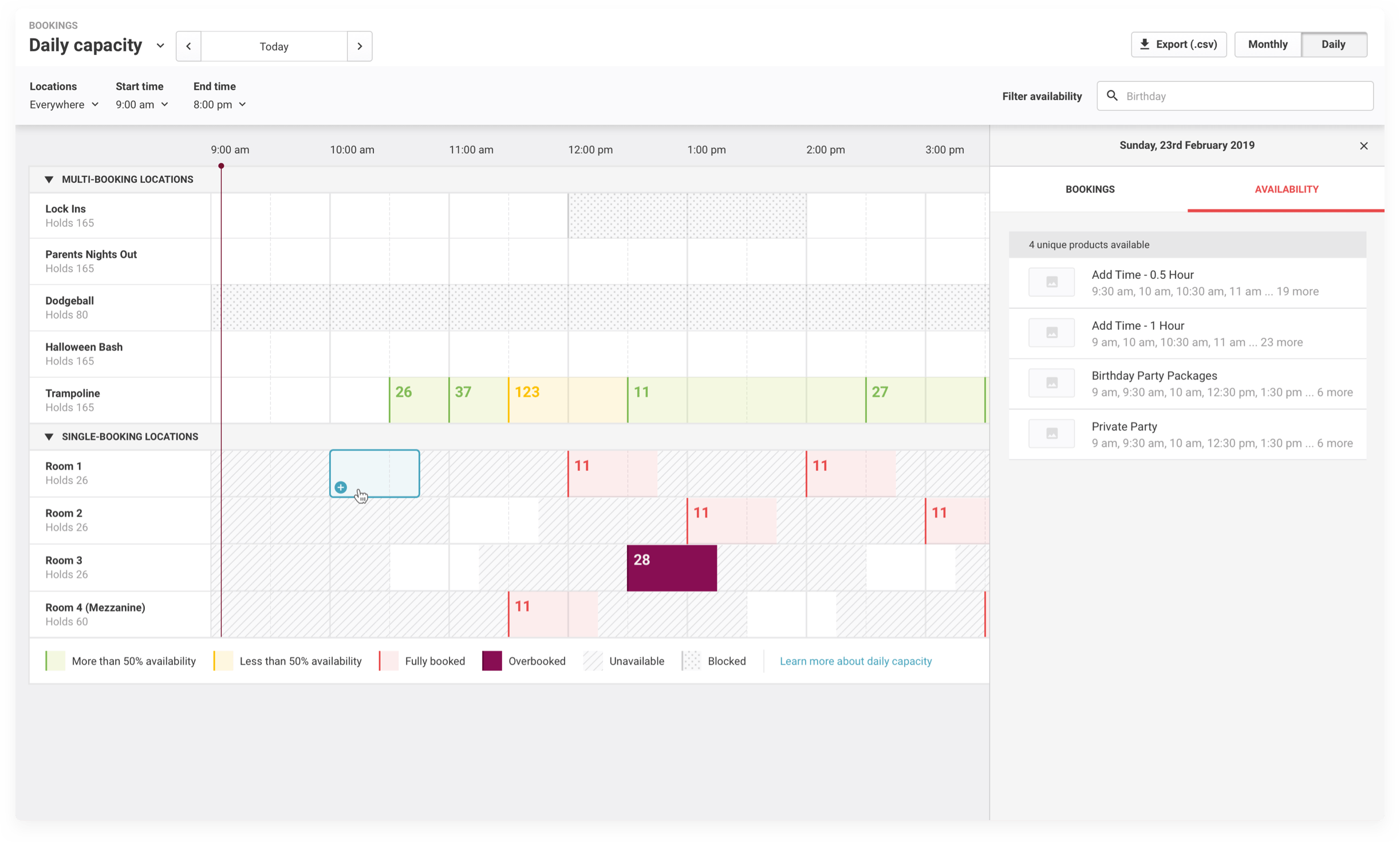
Fig 04. Their selection will shade in the unavailable time slots
Accessing bookings
By using products and categories to filter availability I was able to display the existing bookings as well. A time slot can be selected to jump to the detailed view of that booking or the location can be selected to show a list of bookings.
This kept interaction more focused on a single view when venues are planning out their days. We knew that most kept multiple tabs and windows, one with bookings and the other with the daily view. Giving them the ability to use daily capacity to view their bookings as well the capacity streamlined their workflow.
This kept interaction more focused on a single view when venues are planning out their days. We knew that most kept multiple tabs and windows, one with bookings and the other with the daily view. Giving them the ability to use daily capacity to view their bookings as well the capacity streamlined their workflow.
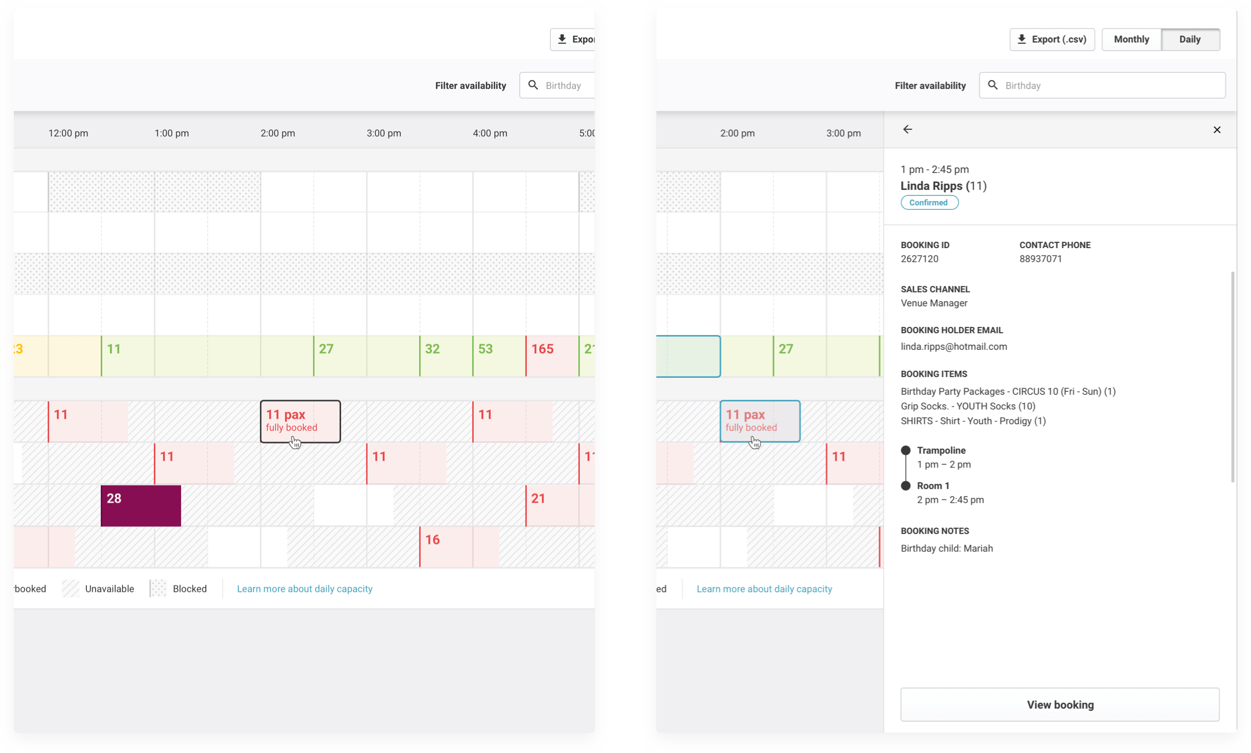
Fig 05. Select a time slot to view its booking
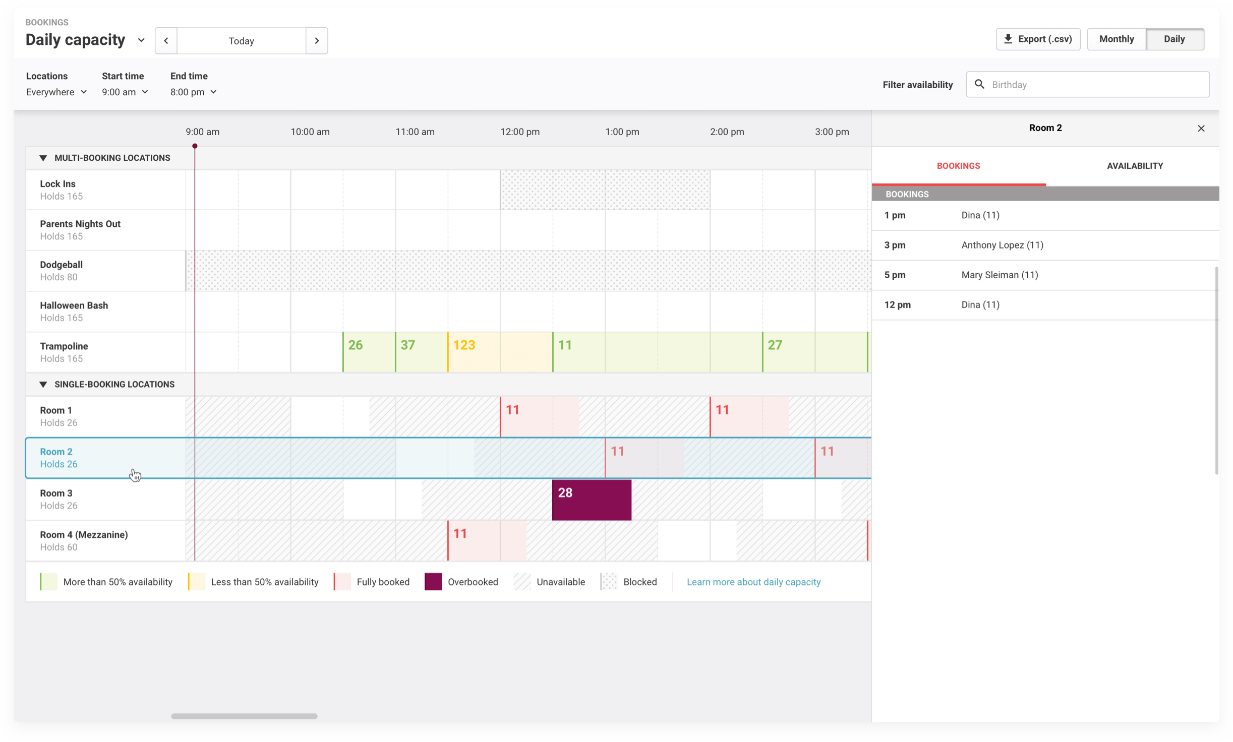
Fig 06. Or select a location to view a list of bookings
Takeaways
1. Use real data
When starting this project I only had basic knowledge about how this feature worked. Through digging into different venue setups to view realtime data and asking questions I improved my understanding. While it may seem obvious that this is the right way to do things, more often time is not set aside to really understand how a feature is used by your users.
2. Respect your brand
While I did end up following an established UI for the calendar view, my earlier experiments informed many of the subsequent decisions and the presentation of booking data. The colour coding and use of products/categories to surface the relevant bookings were born from these experiments.
3. The smallest changes for the most impact
Sometimes an entire redesign isn't necessary. A thorough understanding of a feature, its shortcomings and strengths, can highlight the smallest changes that would improve the quality of life of a feature.
